
I have a CD at home that I made as an eleven-year-old boy. Back then, I came up with my very first band and named it Tuesday On Black. I no longer remember where that name came from. I do, however, remember a sentence I wrote to myself at the end of the booklet:
"This record you own is of great importance."
______________
UNIVERSUM LAND SINGLE COVER
Over the years, this record stayed with me. I never had to search for it or recover it - it was simply always somewhere nearby. When I finished working on my debut album, I realized that its title already existed. "TOB" are the first letters of that childhood band name.
______________

Stage name is built from the names of my parents, Zygmunt and Ewa. It is a simple gesture, but a deliberate one. If it weren't for them, neither this music nor I would exist.
______________
"TOB" took about six years to create, but it is a record of a much longer period. In a way, this album is a conversation with my younger self and an attempt to close something that began long before I was even able to name it. It is not a single story, but a collection of chapters: about loss, love, closeness, family, toxic relationships, time, and searching for one's own place.
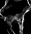
BIGGEST SECRET SINGLE MOVEMENT
Musically, "TOB" moves between electronica, cinematic music, synth-pop, and trip-hop - blending darkness with space, and emotion with sound.
______________
"TOB" consists of 14 tracks that form 7 pairs. Each song has its own "sibling" - sometimes through emotion, sometimes through a storyline, and sometimes through a musical resolution. It is not a puzzle that needs to be deciphered, but I like to think of it that way.
______________
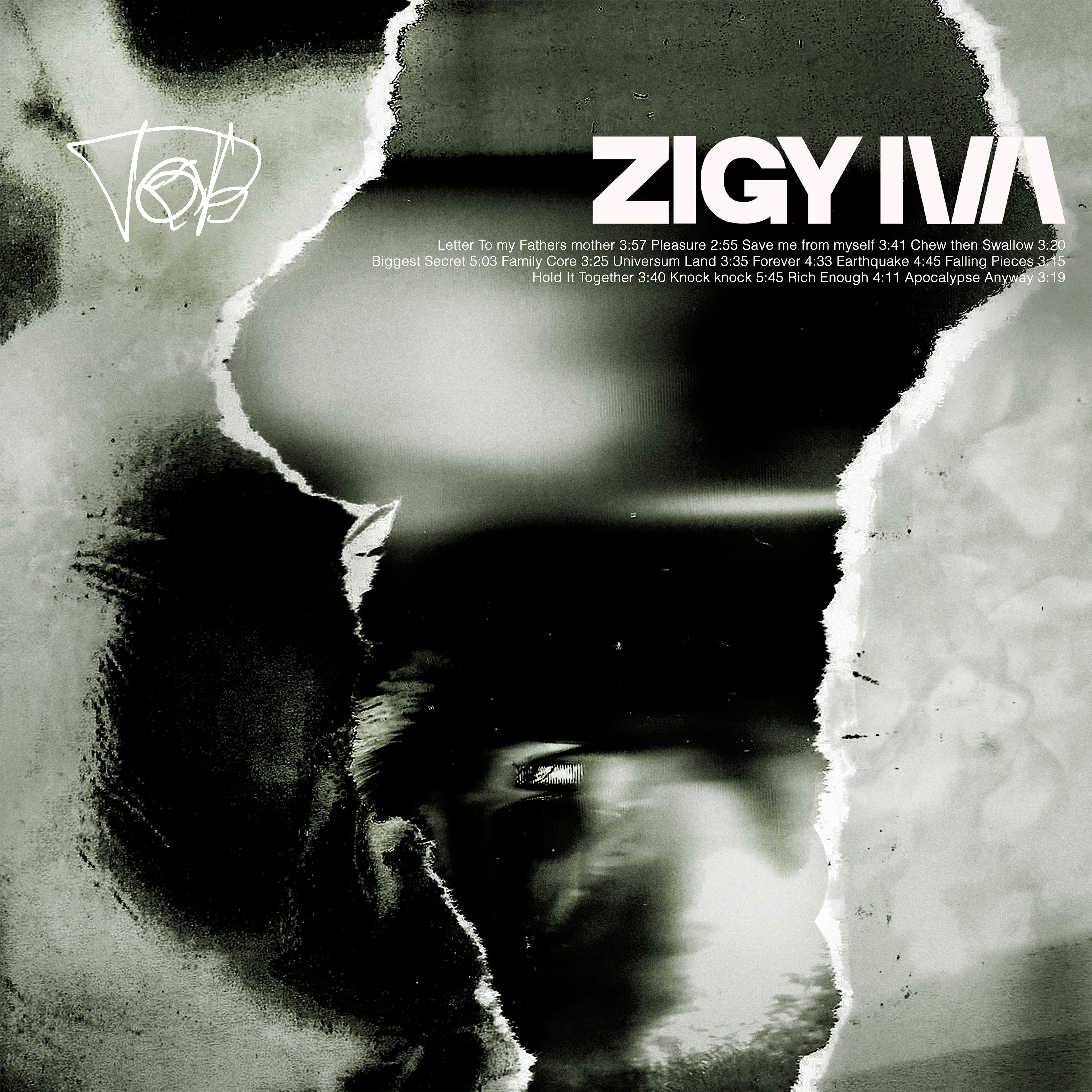
The shape of the tear references the borders of my hometown. Memory, place, and body converge here into a single object.
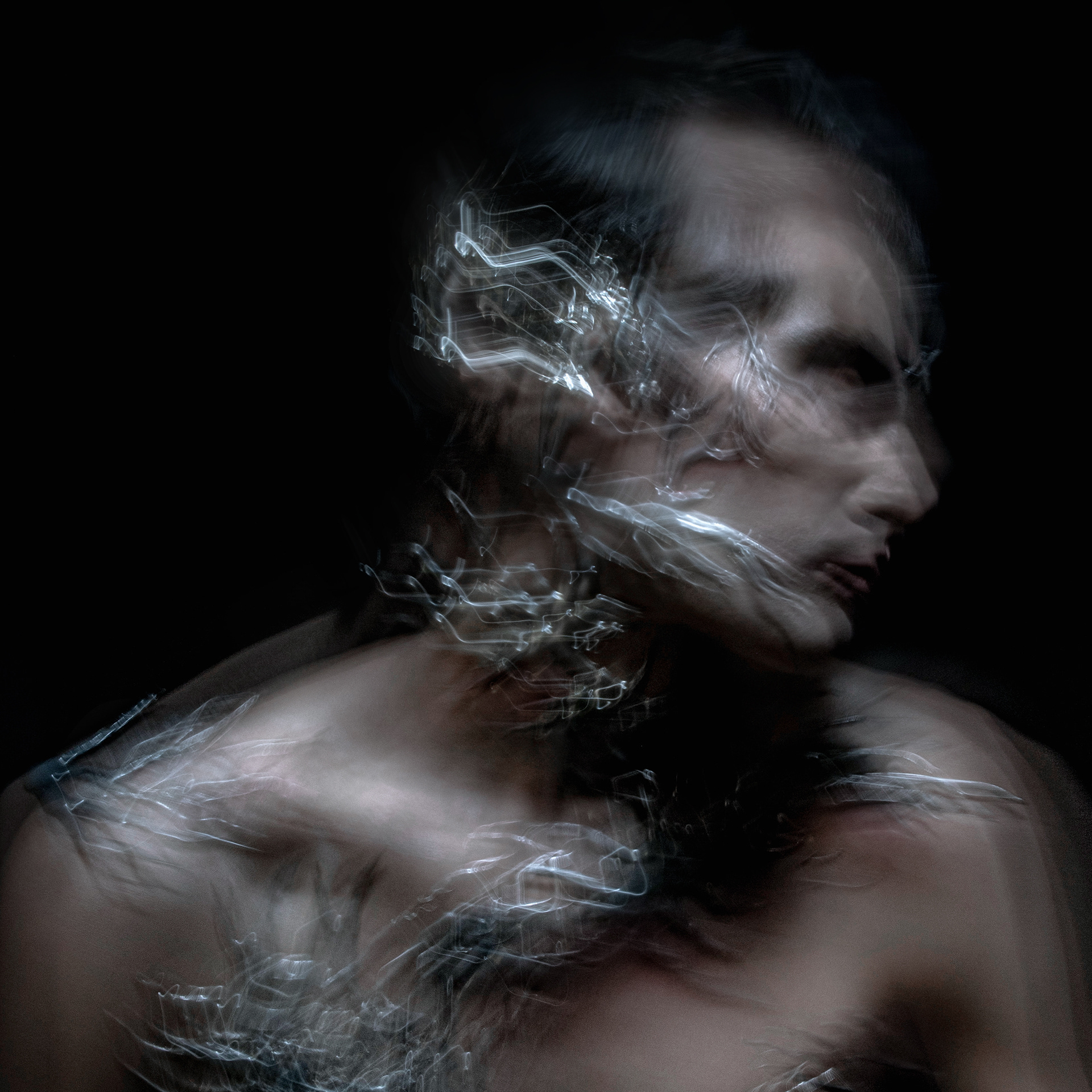
The typography of "TOB" comes directly from the lettering of that childhood booklet, and the visual concept also reflects a second version of the artwork from that time, complete with its distortions and image glitches.
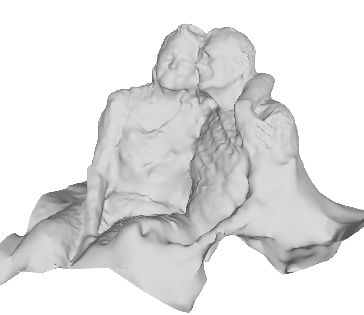
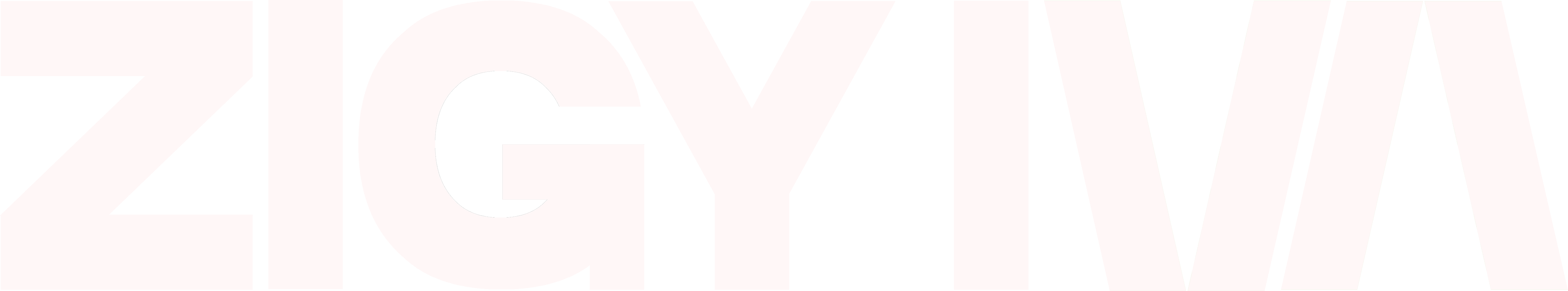
Hidden within the structure are 3D scans of my parents embracing, and the ZIGY IVA logo was designed as a custom typography. The overall aesthetic is rooted in the early '90s-the time of my birth.

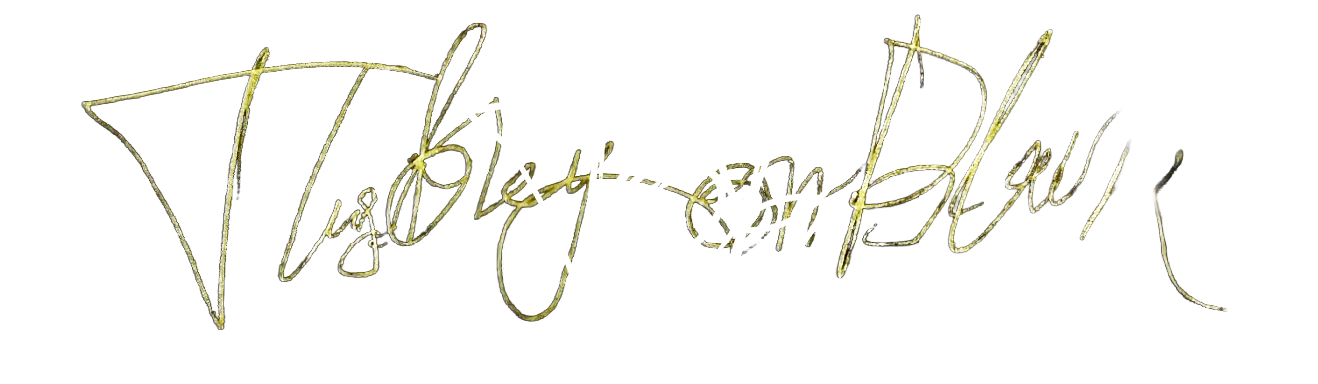
SELF DESIGNED TATOOS COMBINED TOGETHER HAS BECOME AN INSPIRATION FOR A CUSTOM TYPOGRAPHY
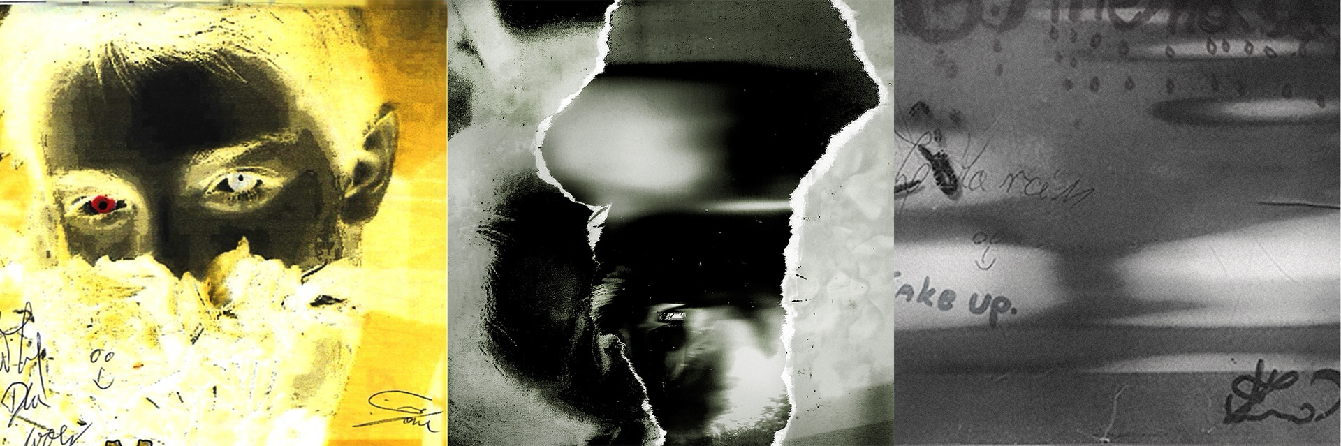
The starting point was the original album cover I made as an eleven-year-old boy. My own portrait, physically transformed through a hand-torn space. Through this fragment passes an actual, live scan of my eye, as if the adult version were stepping into the space of that child.